
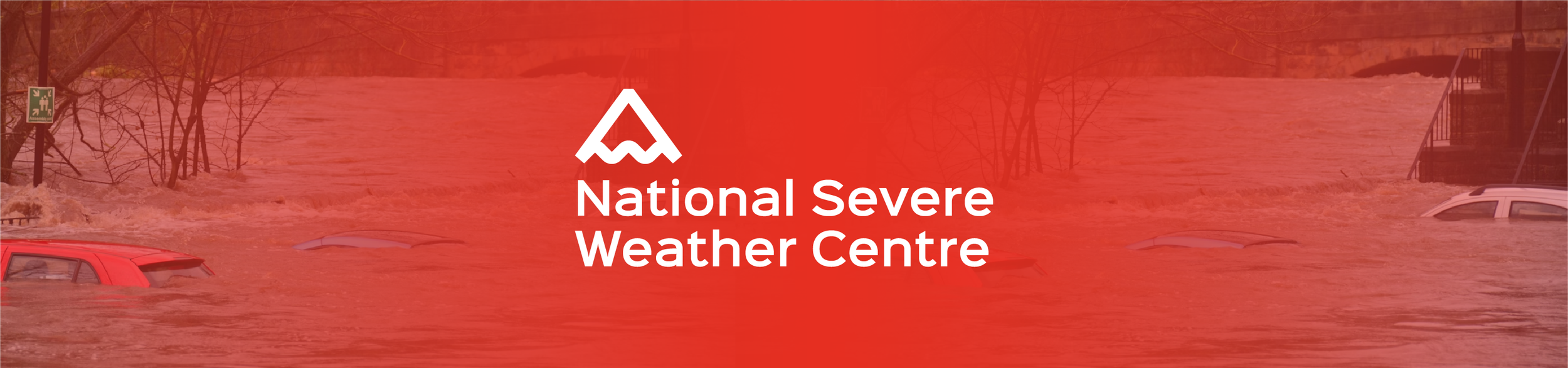
NATIONAL SEVERE WEATHER CENTRE
Self Iniated Project - March 2026
The Conceptual Brief
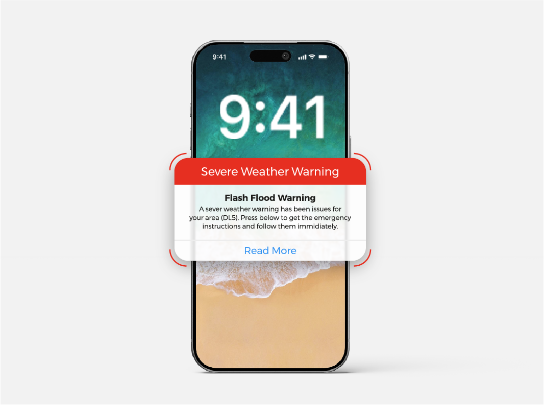
The National Severe Weather Centre required a modern communication system to deliver urgent weather warnings across social media and public platforms.
The challenge was to create a visual identity and campaign that felt authoritative, immediate, and clear, while encouraging younger audiences to take warnings seriously.
The system needed to function across digital alerts, social media, and large-scale public formats such as billboards.
THE BRIEF
The Approach.
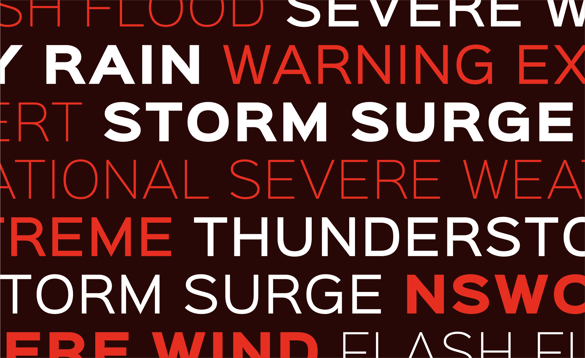
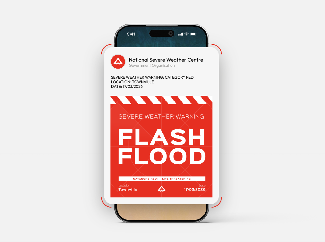
The project focused on creating a system that prioritised urgency and clarity over decoration. A bold, high-contrast visual language was developed to ensure messages could be understood instantly, even in fast-moving or high-stress situations.

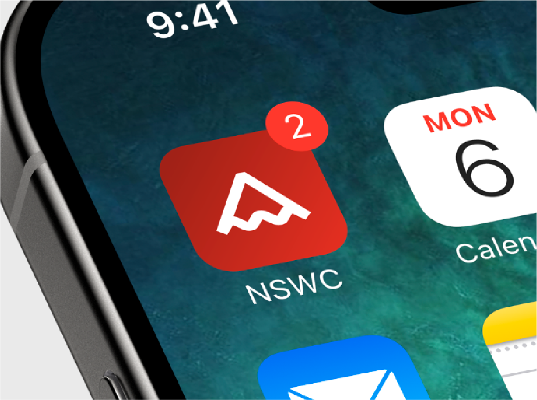
The Symbol.
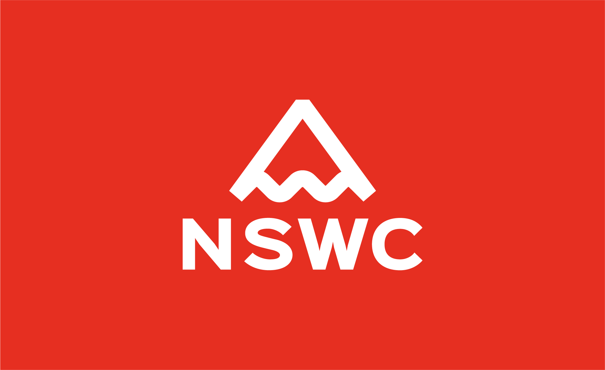
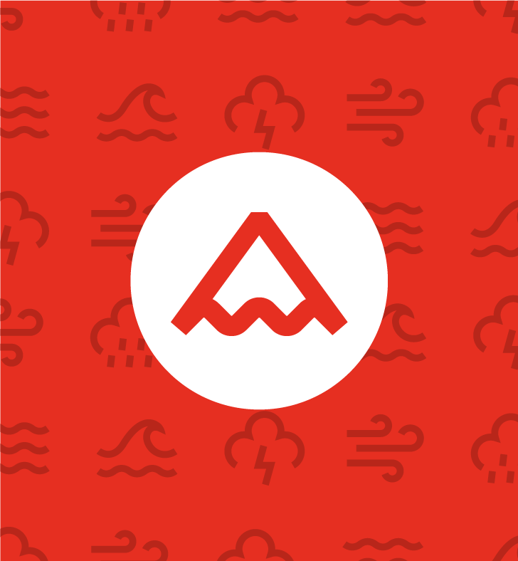
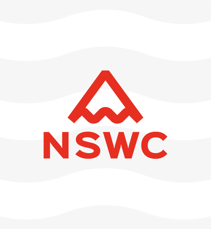
The symbol combines a warning triangle with a wave form, representing both danger and severe weather conditions. This creates an instantly recognisable mark that can scale across multiple scenarios without relying on literal weather imagery.
Striking Colour & Type.
The visual system combines bold typography with a restricted colour palette to maximise clarity and urgency. Red is used as the primary colour across all communications, reinforcing a sense of danger and authority. The system intentionally avoids monochrome applications wherever possible, as removing red reduces the immediacy and impact of the message.
Large, high-contrast type is used to prioritise critical information, ensuring alerts can be understood instantly across both digital and physical formats.
Campaign Messaging.
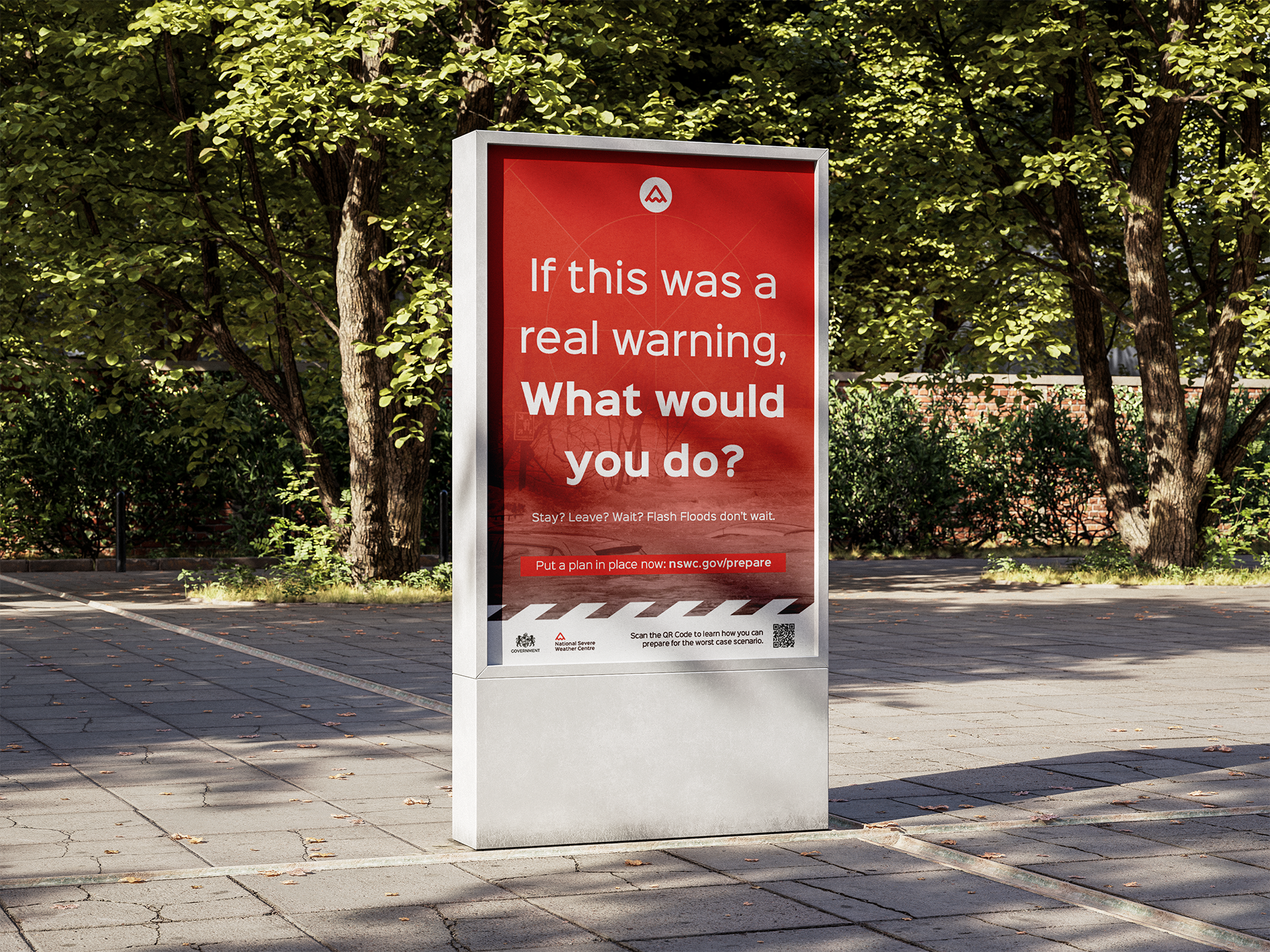
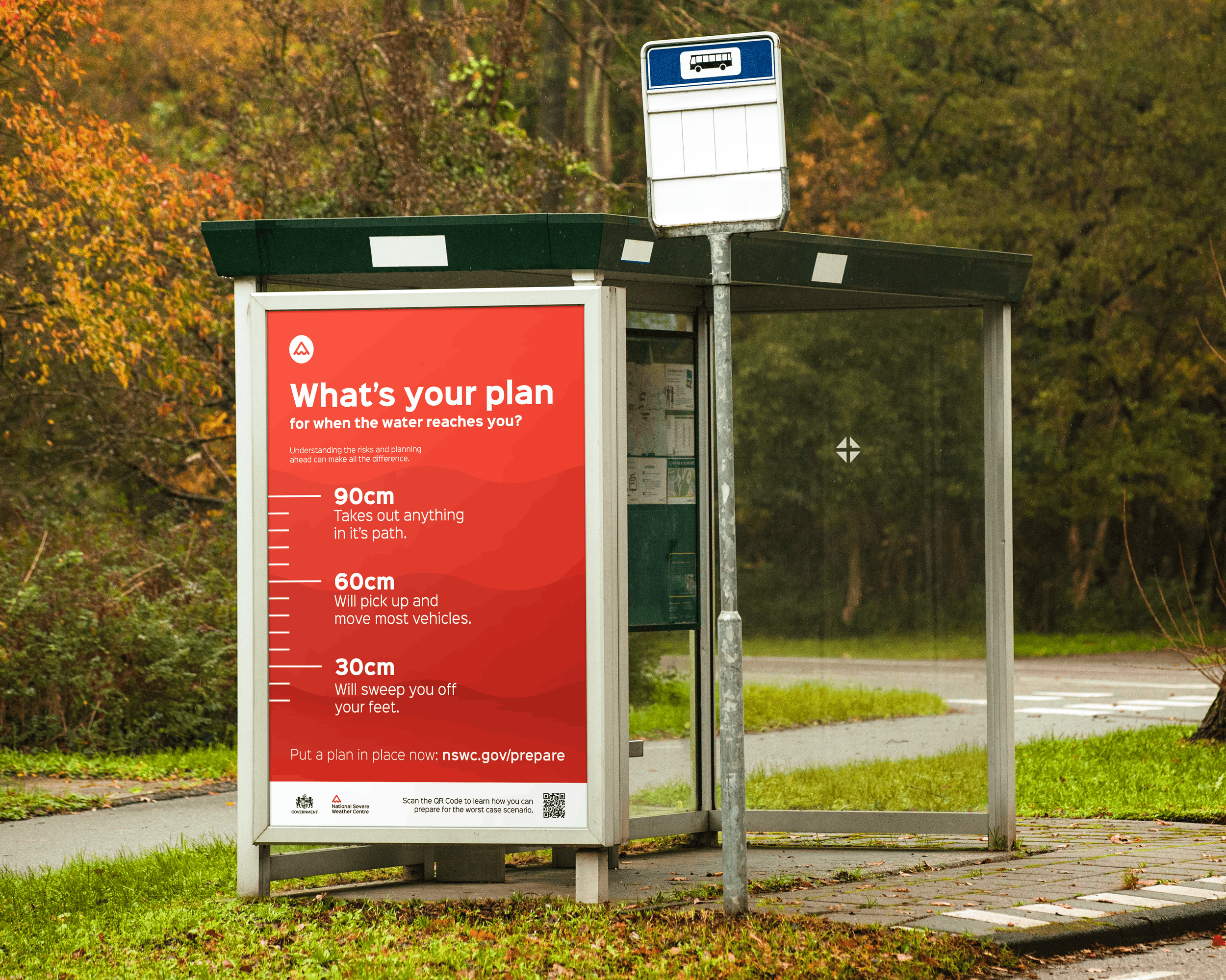
Alongside reactive alerts, the campaign introduces preventative messaging designed to encourage preparedness. Posters and billboards pose direct questions to the public, prompting them to consider how they would respond in an emergency situation.
Further Brand Application
The system was designed to adapt across multiple formats, from social media posts to large-scale public displays.Each format maintains consistency while adjusting layout and content to suit the context.
The Outcome.
This project focuses on clear, direct communication in high-pressure situations. Every element is designed to be understood instantly, with no unnecessary detail or distraction.
If you need design that gets to the point and delivers, get in touch.